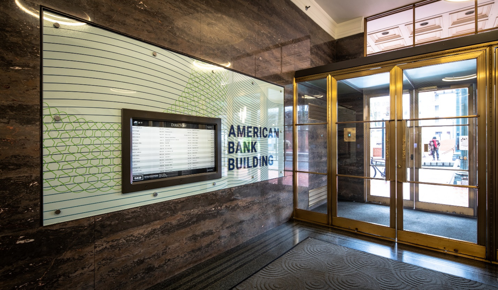
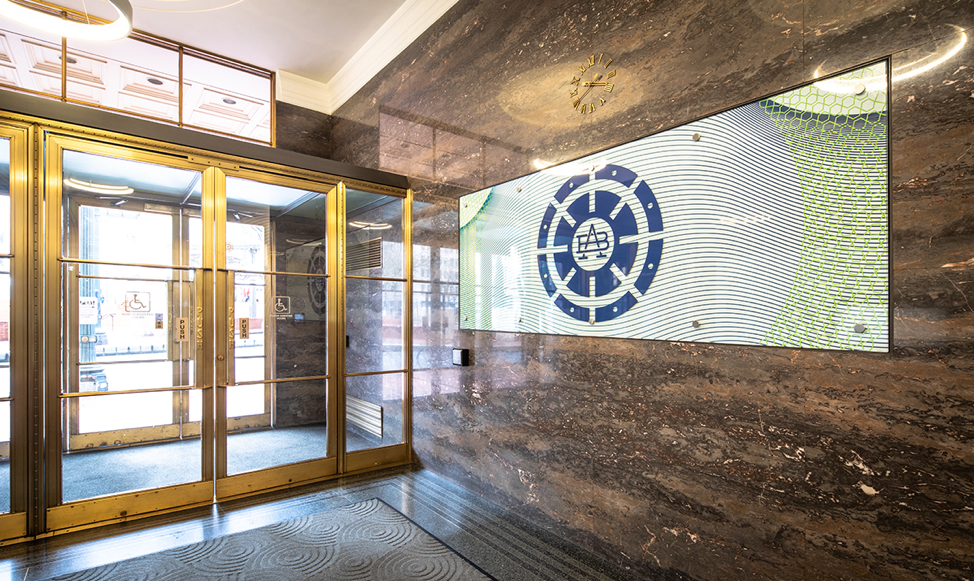
It has been Willamette Print & Blueprint’s privilege, and our challenge, to once again work with Scanlan Kemper Bard (SKB) and their design firm over the past two years to update and transform several areas of the American Bank Building in downtown Portland. The mission was to brighten up the lobby area by covering the brown marble elevator wall with a fresh, modern design. The marble could not be damaged, and the vinyl to be used on the newly designed walls needed to be protected from the busy foot traffic, bicycles and construction gear going in and out of the lobby elevators.
We printed directly to a 3M vinyl, and researched the best laminate to make it “bullet-proof,” as the client requested. You can see from the photos that the mission was accomplished; the lobby looks modern, bright, and fresh. The complex, spiral-like design was challenging to work with and line up perfectly, but well worth it.
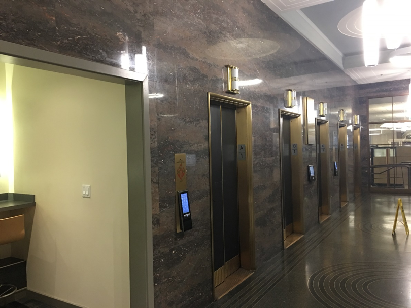
 American Bank Building Lobby Before Decor Update
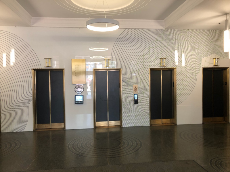 American Bank Building Lobby After Decor Update
Along with the elevator wall in the lobby, we took on the challenge of printing and installing panels inside of the glass panels as well as vinyl on the outside of the cabinets that were inlaid into the walls. This meant coordinating with designers, print techs, installers, glaziers and building facilitators, but in the end, the client was very happy with the result.
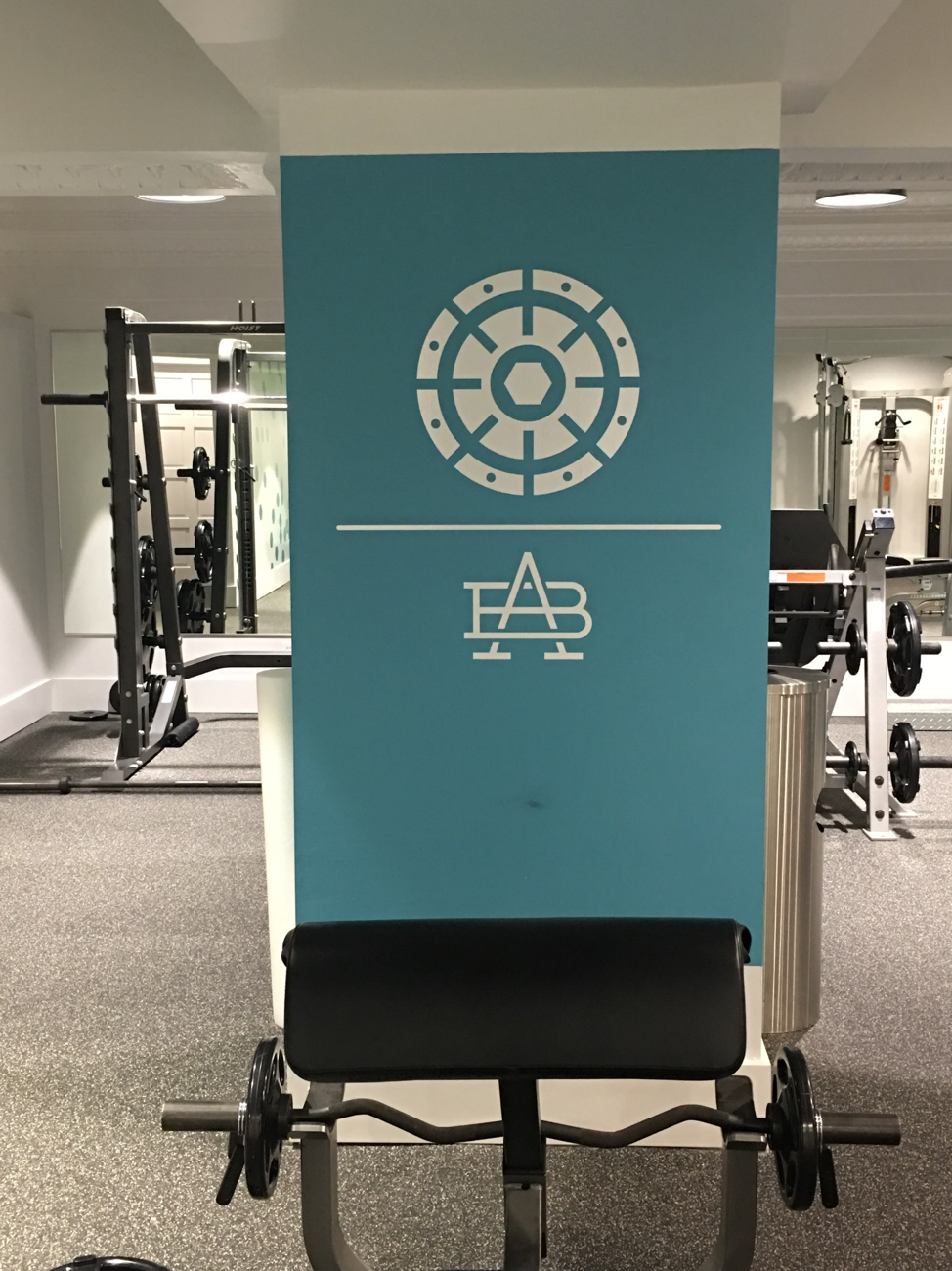
The lobby updated and finished, SKB then moved on to the next floor up, the Mezzanine level. Here the project was to tie in the look from the lobby, and again create an updated, modern feeling in the gym and along the hallway wall. As you can see from the photos of the gym, below, the wall that is covered in laminated vinyl, and the pillar that allows the building’s logo to stand out, create a bright, light, energetic atmosphere.
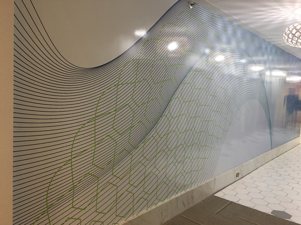
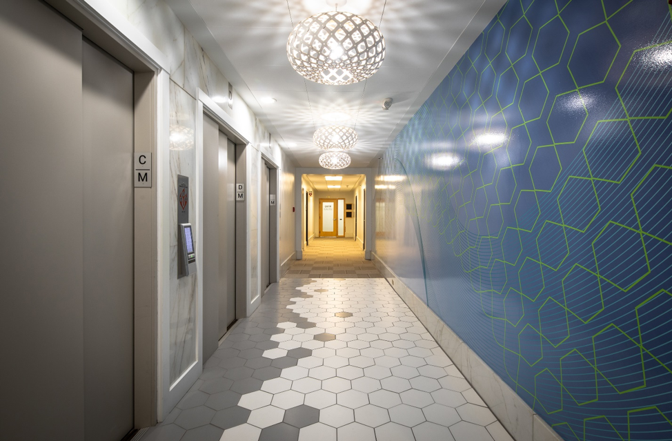
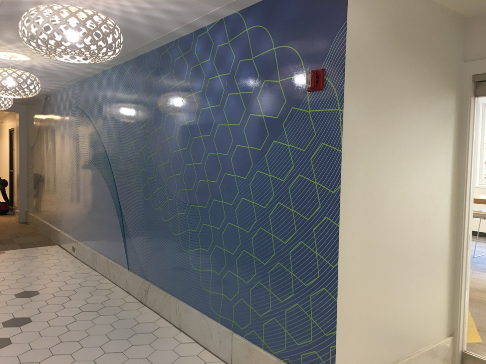

Carrying the design theme to the main wall across from the gym, we again printed directly to vinyl and laminated it to protect it. However, the client wanted it to reflect a little less light than the lobby, so the laminate we used was a luster rather than a glossy.
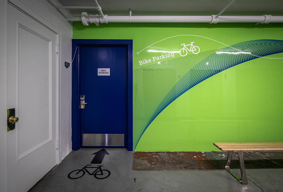
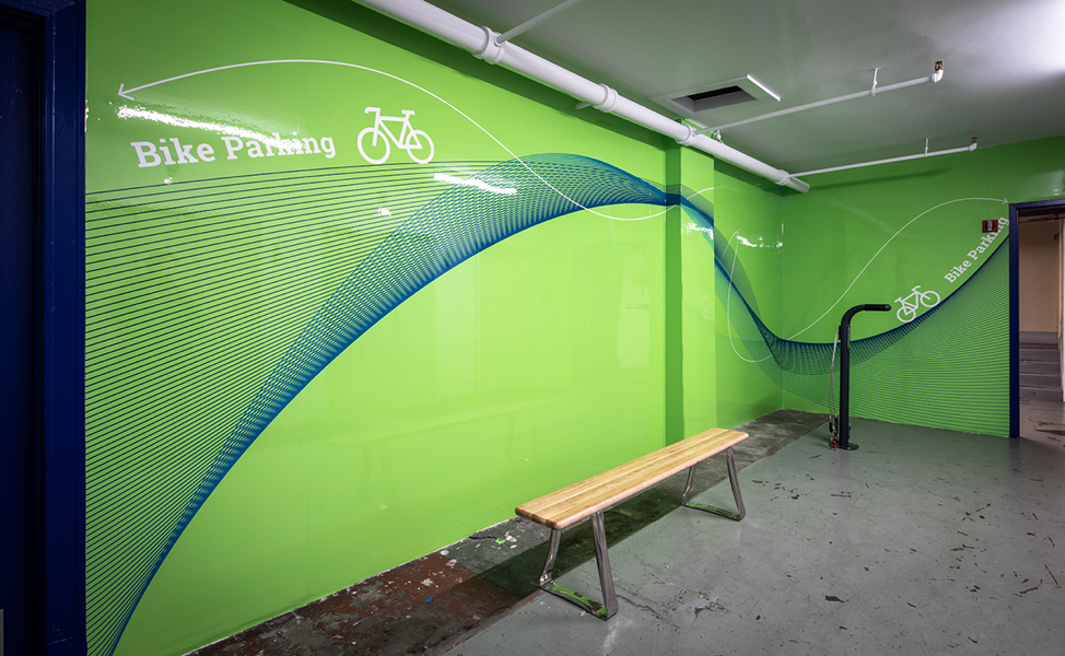
The lobby and Mezzanine floors successfully updated, SKB then moved on down to the basement, where another dramatic transformation would take place; from crumbling, grey, bleak concrete walls to new walls with, again, a modern, fun design would lift the basement from bleak to bright. Because this is where bicyclists pass through to store their bikes, we again provided a bullet-proof lamination process to ensure they look great for a very long time.
 Printing is about more than just putting ink to substrate. It is about relationships and teamwork. The entire WPB team consulted with the client, the designers, the installers, and the building facilitators to update this classic building. We listened to the client needs, checked out the site numerous times, researched the best materials and offered suggestions. We were so fortunate to work with a very professional client and an amazing design team.
Photos by Casey Braunger

